8 Large N
By Maximilian Weylandt
8.1 Introduction
This chapter introduces the most common methods for working with ‘large-n’ data, or data where we have a lot of cases. If we want to study a phenomenon across more than 100 countries, or have a survey covering thousands of respondents, it’s simply not possible to look at them one by one in great detail. Even if we spent a lot of time and effort to do so, we would struggle to make a systematic comparison because it’s difficult to keep track of all the relevant information with so many cases.
Two techniques, discussed here, help us in learning about the relationship between variables across a large number of cases. First, we’ll discuss the concept of correlation, a term you will have heard before. It essentially describes if two variables ‘move together’: when one goes up, does the other one go up as well?
Next, we turn to regression, a more powerful tool for identifying associations between variables. Regression is the basic workhorse of quantitative political science (and many other disciplines as well), and understanding linear regression is important to understanding the many methodologies built as extensions of this basic method. We begin with a bivariate regression relating one explanatory variable to a response variable to look at the logic underpinning regression. The basic idea is that we find one equation that best describes the distribution of our data points, and therefore at a glance tells us how our two variables are related.
Then we move on to variations of regression, how to interpret regression results, and examples of how the method is used in political science.
8.2 Method: setup/overview
8.2.1 Correlation
You have two variables that you think might be related in a linear fashion. Let’s say you think that a country’s level of education (measured in expected years of education) will be related to its level of gender equality (we’ll use a points system based on the UN gender inequality index) . Using software, you can quite easily calculate a linear correlation coefficient for these two variables, denoted by \(R\). For these two variables, we get the result \(R=0.83.\) That number is a bit abstract but the graph below, figure 8.1, visualizes what different correlations look like.
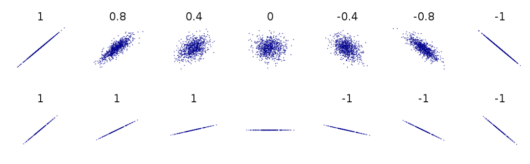
Figure 8.1: Different correlations, visualized. The numbers represent correlation coefficients. Based on Boigelot (2011), modified by Max Weylandt
Correlation coefficients can range from -1 to 1. Imagine that the different graphs in figure 8.1 represent the different possible relationships between education (along the \(X\)-axis) and gender equality (on the \(Y\)-axis). As the top line of figure 8.1 shows, a correlation coefficient closer to either pole means a strong correlation while a number around 0 means a weak correlation. If \(R=-0.8\), there is a strong negative correlation (at larger values of X, Y tends to have lower values). If \(R=0.4\), there is a moderate positive correlation (at larger values of X, Y tends to have higher values). The correlation we got indicates that we have a fairly strong positive correlation. In other words, countries with higher levels of education tend to have higher gender equality overall.
But also note the difference between the two lines in the graph above. In the bottom line, every image represents a perfect correlation, even though the relationships between \(X\) and \(Y\) are clearly very different. On the first graph from the left, \(Y\) increases a lot as \(X\) moves from its lowest to its highest value. Two images over, \(Y\) still increases as \(X\) does, but much less so. They both move in the same direction perfectly (they have a correlation coefficient of \(R=1\)), but the slopes are different. This has implications for our findings: is gender equality slightly higher in countries with more education, or a lot higher? Correlation cannot answer that question. Later, we’ll see how regression accounts for this difference in slopes. By the way, it is always a good idea to visualize your data. The graphs in figure 8.2 below show three datasets that have almost identical means, medians, and correlations - yet look quite different when plotted.
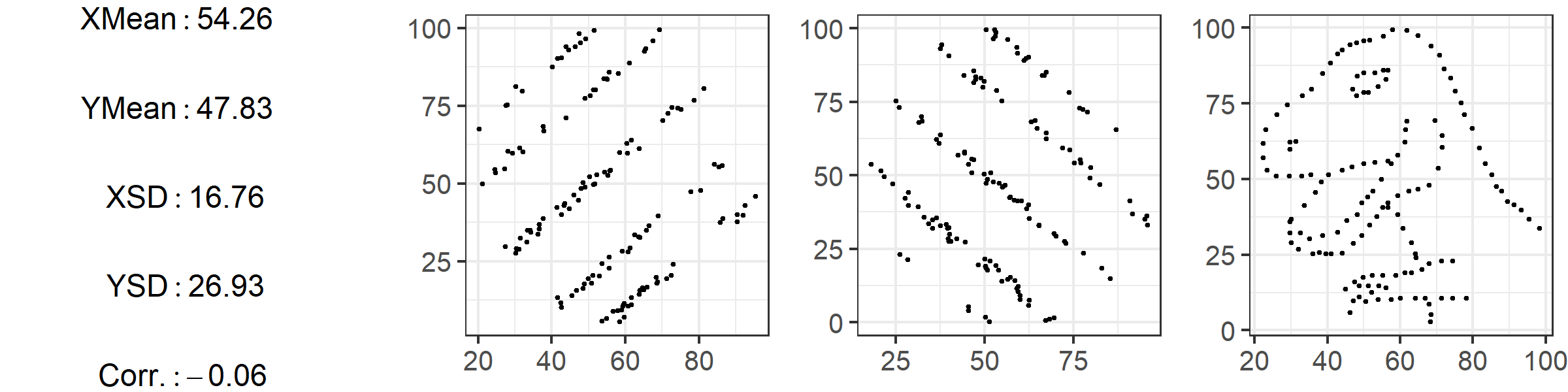
Figure 8.2: Based on the “Datasaurus Dozen” by Matejka and Fitzmaurice (2017)
Correlations can easily be calculated with statistical software, and the number of datasets available to researchers has exploded in recent years. This means that, now more than ever, you can conduct exploratory analyses with a large number of variables to see which ones are related to each other or the outcome you are interested in. This process, of looking at large number of variables and seeing how they relate, is sometimes called data-mining. Data mining can be an acceptable part of an inductive theory-building process (see ch02), but it is a fraught process: when looking at a large number of variables you are bound to find some that show a relationship, and it can be tempting (even subconsciously) to write up only results that confirm our hypothesis rather than those that don’t.
Check-in Question 1: What does a correlation coefficient tell us? What does it not tell us?
8.2.2 Regression
Correlations are a useful first look at the relationship between two variables, but linear regression is far more powerful. The intuition behind linear regression is simple: we want to find the line that best fits all of our data points. This is because the line that fits the data best summarizes the relationship between variables, and we can use this line to learn not just the direction of an association (positive or negative) but also its strength: as \(X\) changes, how much does \(Y\) tend to change? Regression also lets us conduct significance tests to establish whether the relationship between variables actually exists or just appears to occur due to chance.
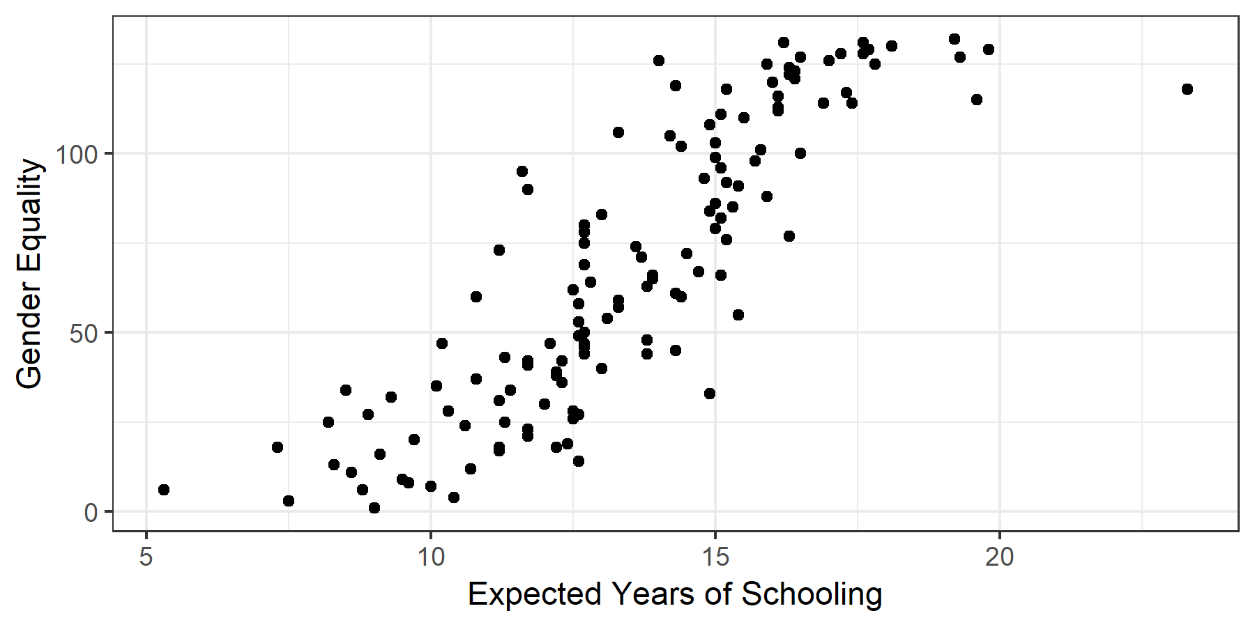
Figure 8.3: A simple scatterplot
Perhaps it’s best to start with an image. Figure 8.3 charts the values for 147 countries’ expected years of education against their scores on the equality index, with each country represented by a dot. Just from looking at it, you can see that countries with a high level of education tend to have higher levels of overall gender equality, even if not all countries neatly fit that description. In other words, as predicted by our correlation coefficient of 0.85, it seems that there is a relationship between education and gender equality. But how strong is this association?
To answer the question, we draw the line that best fits the data points in the scatterplot. This straight line (this is linear regression after all) summarizes the relationship between the two variables we are interested in. Imagine we wanted to explain the relationship to someone else but couldn’t show them the individual data points. We could still show them the line and they would get a sense of how gender equality and education relate.
The regression equation takes the form: \[Y = a + bX\]
Take a second to appreciate what we have done here. We’ve taken data on two variables for 147 countries, and summarized it with one line on the graph, which we can in turn express as this simple formula. The formula may look familiar to you, as it is simply the formula for a straight line. In the above equation \(a\) is the intercept – the value \(Y\) takes on when \(X=0\). In other words, what is the level of gender inequality that a country with 0 years of expected schooling would have? \(b\) is the slope. Remember the function the slope plays in a graphs: it gives you ‘rise over run’, telling you how much the \(Y\) tends changes in relation to the \(X\). This means that in a regression equation, the slope is very important, because it expresses the relationship between our variables: on average, a one-unit increase in the X variable (in our case, one year of extra expected schooling) is associated with a \(b\)-sized increase or decrease in the outcome variable (points on the gender equality index). The slope \(b\) is often also called the regression coefficient. In the case of our regression line, \(b=11.6\). As you will see below, we often encounter regressions with multiple variables, each of which has its own coefficient (i.e. change in the outcome variable associated with change in the independent/input variable).
In our example, the intercept \(a=-89.2\). This is a good time to warn you about extrapolating using data from regression. That intercept is impossible, because the way our outcome variable is set up, there are only positive scores for equality. Yet because of the best fit line, our regression predicts an impossible value for \(Y\) when \(X=0\). Always remember that regression fits the line based on the data available. If you want to use it to make prediction about data points far away from the data you actually have, it is possible the prediction will be way off. (By the way, you can find the values for both \(a\) and \(b\) in Table 8.1 below. We’ll discuss how to interpret the table in more detail below, but feel free to see how much you can get from it right now).
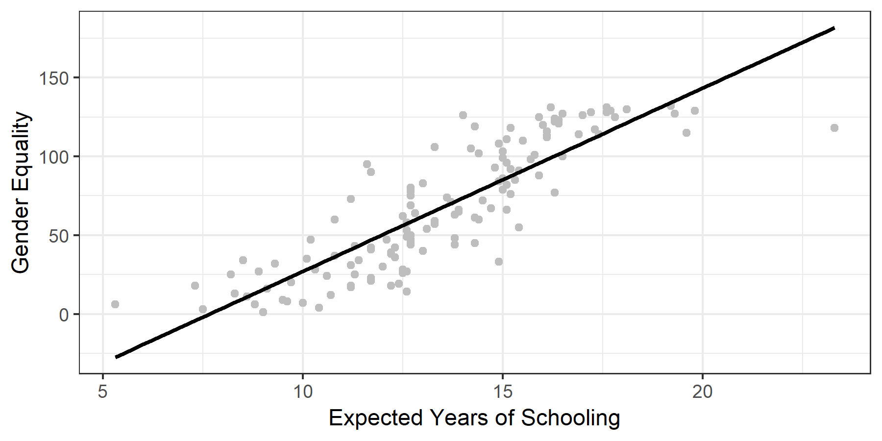
Figure 8.4: The regression line
8.3 Method: detail
8.3.1 Finding the Line of Best Fit
How do we find the line that fits the data best? Let’s restate our aim: we want a line where, given a certain \(X\) value, the \(Y\) value predicted by the line is really close to the actual value in the data. That seems like a reasonable definition of ‘good fit.’ Rephrased in mathematical terms, we want to be as small as possible. The thing we want to minimize is called a residual. For example, in 8.4, Serbia has an expected years of schooling value of \(14.6\) and a gender equality score of \(106\). Those are the actual values in the dataset. However, the regression line predicts that an education (i.e. \(X\)) value of \(14.6\) is associated with a gender inequality score of \(82.94\) [\(Y= a+ bX= -89.2 + 11.6 \cdot(14.6) = 80.16\)]. The residual amounts to \(25.4\) [\(106 - 80.16=25.4\)], and is highlighted with a blue line in 8.5.
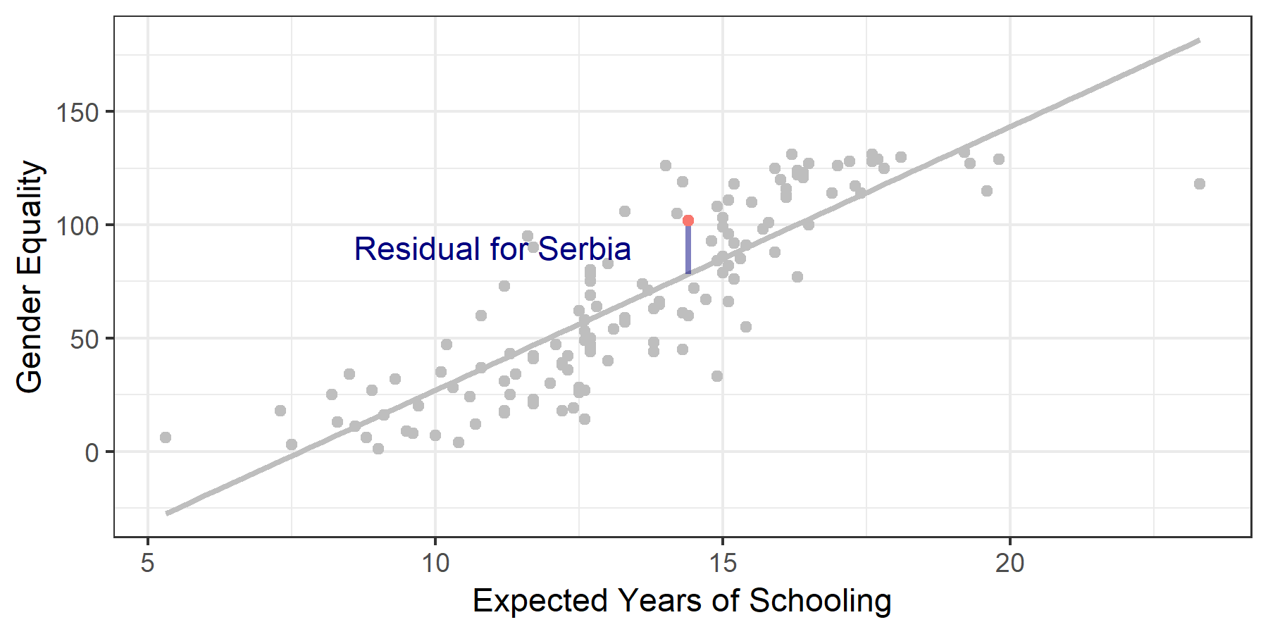
Figure 8.5: Visualizing Residuals
We take a cumulative look at all of our residuals to see which line fits best. There are several possible methods for doing this. Simply adding up the residuals would give us misleading results: some are negative and some are positive, and they would cancel each other out. To deal with this problem we square each residual. This makes all values positive, and has the added benefit of penalizing larger differences between our line and actual values. We find the line that best fits our data by minimizing the squared residuals. This procedure is called ordinary least squares.
The line you see in figure 8.5 is the line of best fit. Still, as you can also see, there are residuals. This is because in linear regression we are trying to find one single straight line to best predict the data, which always results in some points being off the line. A line that hits all points is possible but its equation would be so complicated it would be impossible to interpret. The key is that any other line would have residuals that are overall further away. The image below shows how different lines have drastically different squared residuals. For an interactive example that lets you adjust the line and see how the squared residuals change, check out the second image on this page.
As you can see, we can draw an infinite number of lines through our data, but the one where the squared residuals are lowest is the line of best fit – the line that best describes the relationship between our variables X and Y.
Check-in Question 2: Why do we want to fit a line through our scatterplot?
8.3.2 Significance Tests
Regression lets us test whether the relationship between our variables is statistically significant. We begin by setting up a hypothesis test in the format with which you are already familiar. Our null hypothesis is that the relationship between variables \(X\) (education) and \(Y\) (gender equality) — AKA the coefficient \(b\) – is zero.
\[H_0: b = 0\] \[H_a: b \neq 0\]
In our example, we find a beta that is not zero, \(11.6\) in the bivariate regression we conducted. How weird is this? We can calculate how unlikely it is to get \(11.6\), if \(b\) is actually 0 like our null hypothesis stipulates. This calculation gives us a p-value for the coefficient. If the p-value is lower than a threshold we set ahead of time, we call the coefficient statistically significant. This just means that we have a high degree of certainty that \(b\) really is not zero.
You can see the details of this calculation in the Mathematical Appendix.
Another way of approaching this issue is to calculate a 95% confidence interval for the coefficient – a range for which we have 95% certainty that the coefficient falls within its confines. In our example, the 95% confidence interval for the coefficient \(b\), which captures the association between education and gender equality, is \([10.4, 12.8]\). (You can see the calculation in the Mathematical Appendix ). If the entire range is positive (as it is for us) or negative, it means that we are 95% certain that the true coefficient is not zero. The null hypothesis says that there is no relationship between \(X\) and \(Y\). But our interval is so far away from zero that we can feel safe rejecting the null hypothesis.
8.3.3 Multivariate Regression
As social scientists, the phenomena we investigate are usually very complicated, and we seldom deal with bivariate relationships alone. In terms of our above example, there are many factors other than education that could affect gender equality. For example, what if wealth is the variable we are looking for, not education? What if it’s simply countries where people are wealthier that have higher levels of gender equality?
A bad way of addressing this issue would be to simply run a second regression, looking at the relationship between wealth and gender inequality, and then compare the results. If we do this, we miss potential relationships between all of our variables. (You may remember this discussion from ch02). Maybe wealth brings more education and also more gender equality, explaining why we think we see a relationship between education and equality. If we are just looking at the effect of education on equality, we are probably giving education credit for some of the variation in equality that is due to wealth. Education’s actual effect would be lower. This is a general rule: When we leave out variables that affect our main relationship, we tend to overestimate the regression coefficients of the variables in our regression. This is called omitted variable bias: leaving out relevant variables results in faulty (usually inflated) estimates.
Luckily, regression allows us to control for other variables. At this point it becomes harder for us to rely on graphs: representing two variables on a graph is easy, but once we add more we are dealing with too many dimensions to represent on a screen (or grasp with a human brain, at some point!). What you need to know is the following: we can remove the influence other variables have on the outcome variable and look at the effect of only our variable of interest. When you read a paper that talks about “controlling for” or “keeping constant" other variables, this is what they are doing – once we have accounted for the variation in the outcome explained by ‘control variables’, what is the relationship between the variable we care about and the outcome? The neat thing is that the output we get from running a multiple regression doesn’t just report on our main variable and the outcome, now controlling for other factors. Instead, it gives us the association between every single variable and the outcome, controlling for all the other variables included in the calculation. Thus including several variables in one regression is desirable for two reasons: first, because we simply want to know the effect of several variables, and second, because leaving out relevant variables would give us less accurate results.
A multiple regression with two explanatory variables can be written as: \[Y = a + b_{1}X_{1} + b_{2}X_{2}\] Academic papers will often use \(\beta\) instead of \(b\), \(\alpha\) instead of \(a\), and sometimes even write variable names directly into the formula. In terms of our example we could write: \[Ineq = a + \beta_{1}EDU + \beta_{2}GDP\]
Here, \(\alpha\) is the intercept (the value of gender equality we predict when both education and GDP are at \(0\)), \(\beta_1\) tells us what change in gender inequality is associated with a 1-unit increase in education, and \(\beta_2\) tells us about the association between GDP and education.
Check-in Question 3: why do we control for other variables?
8.3.4 Reading a Regression Table
When reading quantitative papers, chances are you will read a regression table. Reading regression results is a key skill for engaging with political science research. It will save you a lot of time, give you results at a glance, and help you critically compare the actual results of an analysis with the findings the authors present.
Let’s look at a regression table that shows the results of our analyses, Table 8.1. As you can see, each variable gets its own row – often the main variable of interest is in the top row. Also, each model gets its own column. Broadly, a model is a different way of looking at the statistical relationship between our variables. In our case, model just refers to different combinations of variables. Other times, different models can feature more complicated differences in statistical calculation. Column (1) shows the results of our first model, which is the simple bivariate regression we began with. Here, in the line for expected years of schooling, you can see the coefficient for the variable. You interpret this as discussed above: a one-unit increase in the variable (education) is associated with a 11.6 unit increase in the outcome variable (gender equality). In other words, one extra year of expected schooling is associated with an almost 12 point higher score on the gender equality index.
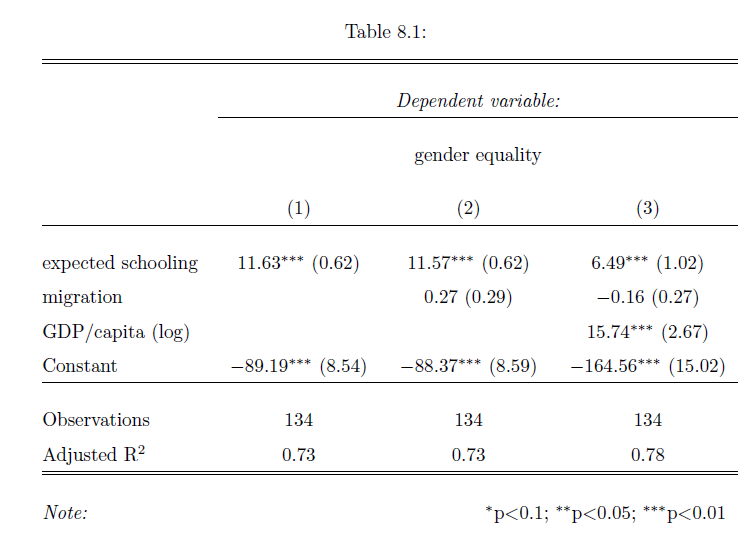
Table: 8.1
The little asterisk next to the coefficient is a very common symbol to denote statistical significance. A legend at the bottom of the table (as in our example) will explain what different symbols mean. You can see that education is statistically significant at the 0.01 level - we are quite certain the coefficient is not zero, and therefore quite confident that there is an association between education and gender equality. Right next to the coefficient and the asterisks is the standard error - our measure of uncertainty regarding our estimate of the coefficient.
Column (2) shows the results of a second model where we also add the net migration of a country. We can also read the association with this variable from the table: the ndicates that a 1-unit increase in the migration index results in a 0.27 increase in the gender equality index holding all other variables constant, but the finding is not statistically significant.
In Column (3) we add GDP/capita to account for different levels of wealth, and you can see that the s substantially lower than in the previous two models. The table indicates that a one-unit increase in education is now associated with a 6.5 point increase in gender equality, holding all other variables constant. This change in coefficient illustrates the problem of omitted variable bias. Before we explicitly looked at the relationship between wealth and gender inequality, we were giving education too much credit. It seems that GDP explains some of the variation in gender equality that we had previously attributed to schooling. Indeed the coefficient is sizable and statistically significant.
Table: 8.2
The coefficient of our main variable of interest - education - changes a fair amount when we change the model. When an association remains despite us changing the models around, we say that it is robust. If our variable remains significant across different models, it gives us more confidence that the association is actually there. If introducing control variables means that the main interest is not significant, we would question whether our association is actually there or not. There is no hard and fast rule for judging robustness. In our case, controlling for GDP did mean that the effect size of education went down by quite a lot. This is somewhat worrying. On the other hand, education did retain a statistically significant association throughout.
You’ll note that the variable is called GDP/capita (log). This reflects a common practice when dealing with GDP, which is to convert the values first before using them in the regression. This is statistically sound, but makes interpretation more difficult – see the Mathematical Appendix for more details if you are interested.
The final line among our variables, Constant, denotes the intercept. Sometimes this is at the bottom, sometimes at the top of the table. We already discussed how to interpret this: if all \(X=0\), the regression line predicts that \(Y\) will equal the value of the intercept.
Let’s move further down the table. The \(\mathbf{R^2}\) tells us how much of the variation in Y is explained by our regression line. The regression line above (model 1 in the table) has an \(R^2\) value of 0.73. This is also referred to as “goodness of fit" (i.e. how well does the data fit the line?). This \(R^2\) indicates that our regression line accounts for \(73\%\) of the variation in gender equality.
It is tempting to simply scan the table to see which variables have stars associated with them, and conclude only they matter because they have statistical significance. But statistical significance is not everything. We also have to consider substantive significance, which is linked to the size of the coefficients. If a regression shows that a variable is significant at the .01 level, but it has a tiny coefficient, what does it mean? It means the variable may well be associated with a change in the outcome variable, but that this change is tiny. As social scientists, we are studying real-life phenomena and so we should care about the substantive impact of different variables on our outcome. We want to see effects that are perceptible in real life, not just in the data! On a practical note, however, do not be surprised by small effect sizes. The phenomena we study are complex and so it often makes sense that any given factor only has a small effect. As research methods have improved over the last decades, we have seen a decrease in effect sizes which suggests some older research suffers from omitted variable bias (remember that term?)
In short, here’s how to read a regression table:
Begin with the first column and read it top to bottom. Note variables’ coefficient sizes and whether they are statistically significant.
Move to the next column and do the same. See which coefficients change and in what direction. Which coefficients are no longer significant once other controls are added or the model changes in other ways?
Track the main explanatory variable across models. Is it robust to the inclusion of controls and across different model specifications?
Compare your impressions with the descriptions of the authors. Do they discuss all relevant findings, or do they leave something out?
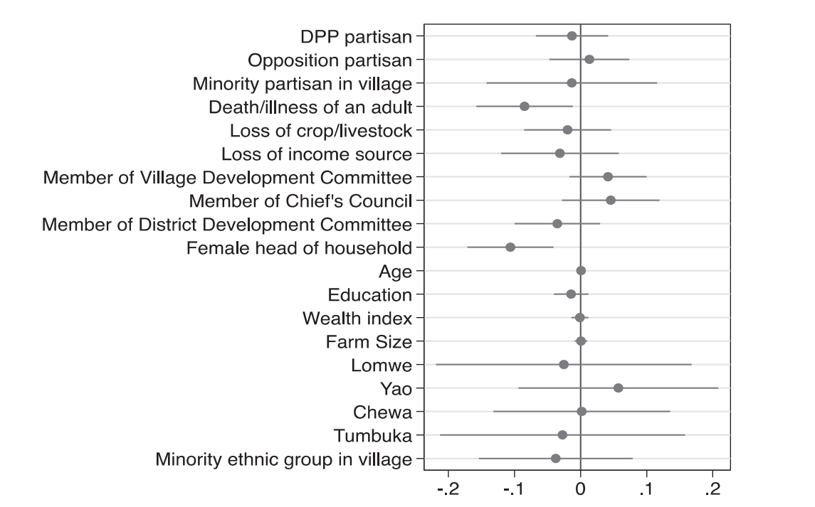
In recent years, more authors have begun to display regression results in a graphical way. Consider figure 8.6 below, which displays the result of Dionne and Horowitz’s 2016 article (Dionne and Horowitz 2016). Their regression estimates the probability of farmers receiving agricultural subsidies. The dots represent the coefficient estimates from their regression, and the horizontal whiskers show the 95% confidence interval. At a glance, you can see that two confidence intervals do not contain 0, meaning we are 95% sure that the real value of these coefficients is not 0 – they are statistically significant. We also see that their value is negative, meaning that households with a female head and those that had seen death or illness were less likely to receive aid.
This figure also shows an example an example of something you should know called a dummy variable. The term ‘dummy’ bears no relation to what these variables do: they only take two values (yes or no, 1 or 0) and can be used to compare groups. When we include a dummy variable in a regression, the output tells us the difference in average Y values across the two groups. In this example, females receive aid at lower rates than males (the two values of these dummy variables). If you look at the variables in figure 8.6 you will see that many of them are dummies: they denote membership in ethnic groups, partisanship, and more. Rather than interpreting the coefficient as "a one unit increase in X is associated with a \(b\) increase in Y," we think "being X rather than not is associated with a \(b\) increase in Y."
8.4 Applications
8.4.1 Correlation
Simple correlations are not as often found in recent scholarship as regression, mostly because regression is far more powerful and flexible than correlation, and hardly more difficult to calculate. Still, as noted above, correlations can be useful for an initial look at the data and when describing data. Take (whitakerExplainingSupportUK2011?), who are trying to understand the success of the UK Independence Party at the 2009 European Parliament Election. The first thing they do is simply check whether support for UKIP correlates with support for the conservative or labour parties in the same geographical area, before moving on to a more sophisticated regression that relates support for UKIP to a number of demographic factors.
You will also encounter correlations in more technical sections of papers, when authors discuss which variables to use to measure certain concepts. For example, there are several different measures of democracy: Polity, the V-Dem Institute, and Freedom House all offer datasets that score each country’s level of democracy for a given year. In papers using democracy as a variable (be it outcome or explanatory), authors often pick one of them rather than running the analysis several times. They might note, however, that the indices are highly correlated – suggesting that results would be similar regardless of the dataset chosen. Below, we will look at a study by Kuenzi amd Lambright where the outcome is level of democracy. They write:
...the polity scores for these 33 cases are highly correlated with the other measures of democracy. For example, the polity scores are also highly correlated with the Freedom House total scores for 2000 (r = –0.88; higher values on the Freedom House measure correspond to a lower level of democracy). (Kuenzi and Lambright 2005, 428)
8.4.2 Regression
We are talking about large-N data in this chapter, and regression is most useful when applied to a fairly large number of cases. Some of this research takes data from different geographical or political units to look at a phenomenon across many cases, like the example about education and gender equality earlier on in this chapter.
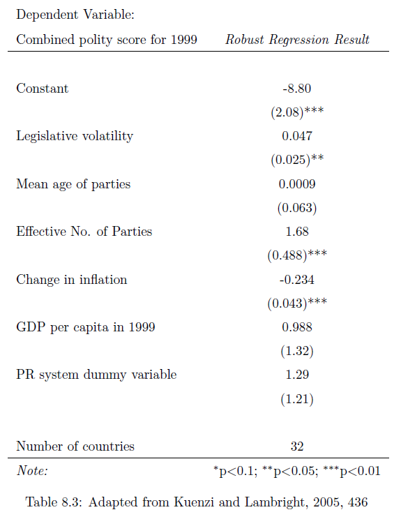
Table 8.3
Kuenzi and Lambright want to look at the relationship between party systems and the level of democracy along a number of African countries. Their outcome is a country’s score on the Polity scale, and their variables of interest are legislative volatility, the effective number of parliamentary parties, and the average age of parties (Kuenzi and Lambright 2005).
Look at Table 8.3 to get a sense of the results. Let’s interpret these coefficients. We can see that a one-unit increase in legislative volatility is associated with 0.047 more points on the polity index, holding all other variables constant. This is significant at the 0.05 level.
Check-in Question 4: Interpret the coefficient for the effective number of parties. What does the coefficient tell us?
8.4.3 Logistic Regression
Logistic regression is a type of regression where the outcome variable, \(Y\) can only take on two values, 1 or 0. (Our discussion about dummies earlier was focused on explanatory (\(X\)) variables).
This is what Garcia (2006) (García-Rivero 2006) does, studying respondents’ feelings about the ruling party in South Africa, the ANC. The outcome variable is whether or not voters felt close to the ANC (1) or did not feel close to it (0). He looks at several demographic indicators to see which factors are associated with support for the ANC. You will find a lot of logistic regressions of this type in the study of elections, where voting intention is often a categorical variable.
Logistic regressions are slightly more tricky to interpret than regular regressions. To illustrate, let’s look at the main table from Ferree (2006) (Ferree 2006), who wants to understand why South Africa’s election results seem to have split along racial lines. The outcome variable is whether voters intended to vote for the ANC (1) or did not plan to vote for it (0). She looks at several exploratory variables, as you can see in Table 8.4.
| Support for the ANC | |
|---|---|
| Performance rating | 0.817 |
| (0.431) | |
| Believe DP is exclusive | -.196 |
| (0.611) | |
| Believe NNP is exclusive | 3.719** |
| (0.604) | |
| ANC partisan | 3.026** |
| (0.582) | |
| Female respondent | -1.454** |
| (0.547) | |
| Age | 0.040 |
| (0.126) | |
| Low schooling (no high school) | 0.998 |
| (1.016) | |
| High schooling (post matric) | -4.400** |
| (0.713) | |
| Political interest | .530** |
| (0.251) | |
| Pseudo R2 | .85 |
| N | 810 |
In the second column of Table 8.4, the coefficient for the variable ‘High schooling’ is -4.4. How do we interpret this? Clearly, we cannot do as we did above: we can’t say that having high schooling is associated with a 4.4 unit decrease in the intention to vote for the ANC, because the only possible values are either 0 or 1.
Instead we can do an anti-log on the coefficients to get odds ratios. What are odds ratios? If the odds of something happening are 50-50, the odds ratio is \(\frac{50}{50}=1\), if they are 80-20, the ratio is \(\frac{80}{20}=4\). These ratios are hard to interpret. We can convert them to probabilities, but these ratios change depending on the value of \(X\). While the interpretation is tricky, know the basic intuition: the coefficients tell us whether the variable is associated with a higher (or lower) likelihood of observing the outcome.
8.4.4 Experiments
You will also likely encounter papers using experiments or quasi-experiments, which also use regression. As we discussed above, we can use dummy variables to compare means across groups. In experiments, this means we can use regressions to see how the treatment affected the treatment and control groups in the experiment, but also how the effects differ for different demographic groups, which we can add as control variables.
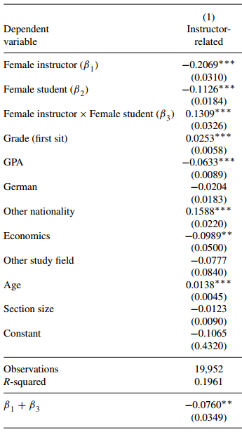
For example, Mengel, Sauermann, and Zölitz (2019) study how gender affects teaching evaluations. There are by now more than 70 studies indicating that women and people of color receive lower teaching evaluations than their colleagues, all else equal. Mengel et al. use a ‘quasi-experiment’: they look at data from courses where students were randomly assigned to sections that could be taught by women or men. They write that “female faculty receive systematically lower teaching evaluations than their male colleagues despite the fact that neither students’ current or future grades nor their study hours are affected by the gender of the instructor" (Mengel, Sauermann, and Zölitz 2019, 536) The regression table to your right provides more detail on controls: economics students, for example, tend to give lower evaluations than students in other fields, and students with high grades in the class tended to give higher scores. Overall, female instructors received lower scores, as indicated by the negative coefficient on the explanatory variable.
8.4.5 Advantages of Method
Regression is flexible, relatively easy to conduct, and intuitive. It enjoys many advantages:
Results are generalizable. If the analysis is done carefully, we might be able to claim that the results we get from our analysis apply in other contexts too.
Regression gives precise results. A regression output will give effect sizes, so not only do we know that one variable is associated with another, but also how large that association is. We can also construct confidence intervals for our estimates, giving us a sense of how certain we can be about the results.
Regressions make it easy to control for other variables. We almost never deal with only bivariate relationships. Regression allows us to hold other variables constant while looking at the relationship we care about, minimizing our fear of omitted variable bias.
Regression allows for iteration. Because of the relative ease of use of regression, other researchers can easily replicate research – and build on it.
8.4.6 Limitations of Method
Measurement. One big problem of large-n quantitative research is that we can only compute statistics for variables we can measure. There are many things that have no measures (for example political will). On issues where we have measures, they are often controversial. For example, many scholars have tried to come up with databases that rate each country on a scale of democracy. But, as you have learned in ch04, coming up with a single measurement for concepts is extremely complicated and always involves trade-offs. What is a democracy in the first place? Which aspects of a society should we consider? How should they be weighed? Many subjective decisions have to be made, all of which can greatly affect the measure given – and therefore statistical results when entered into an analysis.
Average effects. Regression is useful because it gives us a handy, simple output: for each variable it gives us a single coefficient that describes how much changing this variable affects the \(Y\)-variable. However, this is the average effect across all data points in our calculation. Look again at graph 1. The line, which gives us the regression coefficient, describes the data quite well (remember, we chose it because it is the straight line that does the best job of fitting the data!). Still, we can see that for some countries the line does a much better job at predicting the actual values than for other countries. In other words, on average an increase of one unit in education is associated with a \(b\) increase in gender equality. But we should not conclude that this sort of relationship would hold for any one country we look at.
Bad application 1: unrealistic claims of causal inference. The downsides of regression come often not from the method itself, but from how it has been used. Ironically, its ease of use has led to a large number of bad studies, because the ability to control for other variables has led scientists to feel a false sense of security. In reality, we often cannot control for all variables, either because we cannot measure them, or because it is difficult to think of all factors that might affect our outcome variable.
There are many examples of authors claiming a multiple regression shows a causal relationship, using language about “the effect of" one variable on another, and so on. These claims are often unrealistic. As you learned in chapter 2, it is difficult to show causality. To show causality, we need to deal with endogeneity, including reverse causality (does Y cause X?) and omitted variable bias (is a third variable Z responsible for the relationship between X and Y we see in the data?). Another thing that can help is evidence for a mechanism through which X might affect Y. In the absence of such evidence, regression cannot show that one variable causes another.
Bad application 2: kitchen sink regressions. Another thing researchers can do is to investigate a large number of variables until they find some relationship that either confirms their preferred hypothesis, or is at least interesting enough to warrant publication. This is similar to the practice of datamining discussed above, and is sometimes also called ‘p-hacking.’ In fact, it is what I did to make figures 2-4 above: I was interested in a clear chart and regression table, and looked at different variables until I found a combination of variables that worked. With large datasets containing many variables so easily accessible, conducting a number of different regressions is dangerously simple.
8.5 Broader significance in political science
Regression is perhaps the most commonly used quantitative technique in political science. You’ve seen that the basic regression is very flexible and gives us important information – the strength of association between one variable and another, even holding other factors constant. This is very powerful! You’ve also seen one variation of it, logistic regression, but there are many more extensions of the basic concept for a variety of applications. Regression is used to analyze survey data, compare trends across place and time, and to interpret the results of experiments. If you will conduct research using large-N quantitative data, chances are you’ll use linear regression (or a method based on it). If you read research based on large-N quantitative data, chances are you’ll be reading a regression table. Hopefully, this chapter got you closer to being able to do so.
8.6 Application Questions
Explain the meaning of the coefficients \(a\) and \(b\) in the bivariate regression equation.
You collect data on two variables and get the computer to calculate a regression equation for you. To check it, you plug an X-value from the dataset into your equation. The Y-value that results from this calculation is different from the Y-value in the dataset. Is it a problem if the regression’s predicted values differ from the actual values in the data?
8.7 Key Terms
bivariate regression
data mining
logistic regression
multiple regression
omitted variable bias
regression coefficient
reverse causality
robust
statistically significant relationship
8.8 Answers to Application Questions
8.8.1 Check-in Questions
What does a correlation coefficient tell us? What does it not tell us? It tells us how strongly the variables in question are associated. It does not tell us how large that association is. For example, variables can show a perfect linear relationship, but we do not know if an increase in the first variable is associated with a tiny or a large change in the second variable.
Why do we want to fit a line through our scatterplot?
The line that best fits the data gives us a simplified, approximate summary of the relationship between our variables.
Why do we control for other variables? For two reasons. First, we might be interested in how other variables relate to the outcome. Second, we want to hold constant the effect of other variables to avoid omitted variables.
Interpret the coefficient for the effective number of parties. What does the coefficient tell us? Looking across countries with different party systems, one additional effective party is associated with a 1.68 point increase on the polity score, controlling for the other variables in the regression.
8.8.2 Application Questions
Explain the meaning of the coefficients \(a\) and \(b\) in the bivariate regression equation.
\(a\) tells us the predicted value of \(Y\) when all of the \(X\)-values are set to 0. On the scatterplot which visualizes the bivariate relationship, it is the intercept.
\(b\) summarizes the relationship between \(X\) and \(Y\). It tells us how much of a change in \(Y\) is associated with a 1-unit change in \(X\).
Is it a problem if the regression’s predicted values differ from the actual values in the data?
No. In linear regression we are trying to fit a straight line through a large number of data points. This means that one line will never perfectly fit all points. It’s fine if there is some difference - the importance is that we keep those differences (residuals) as small as possible, in a process we call ordinary least squares.